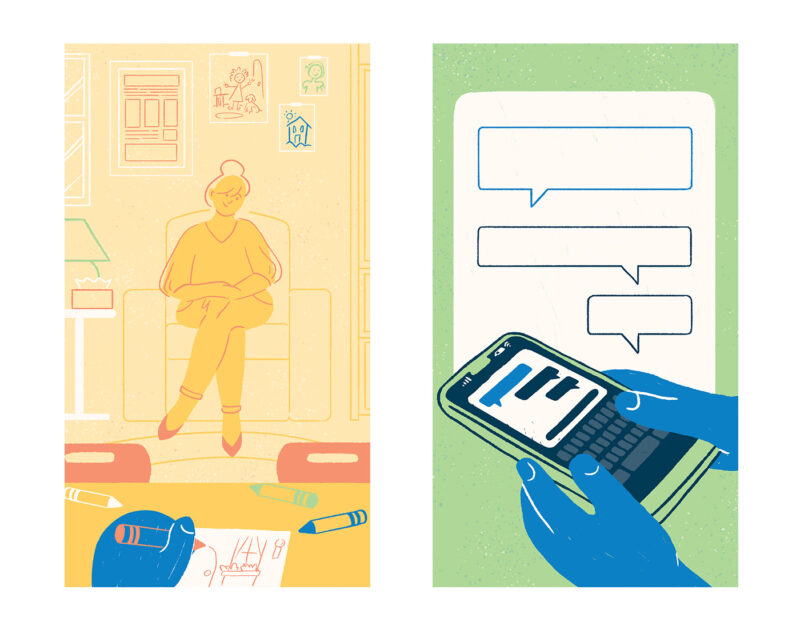
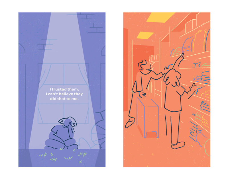
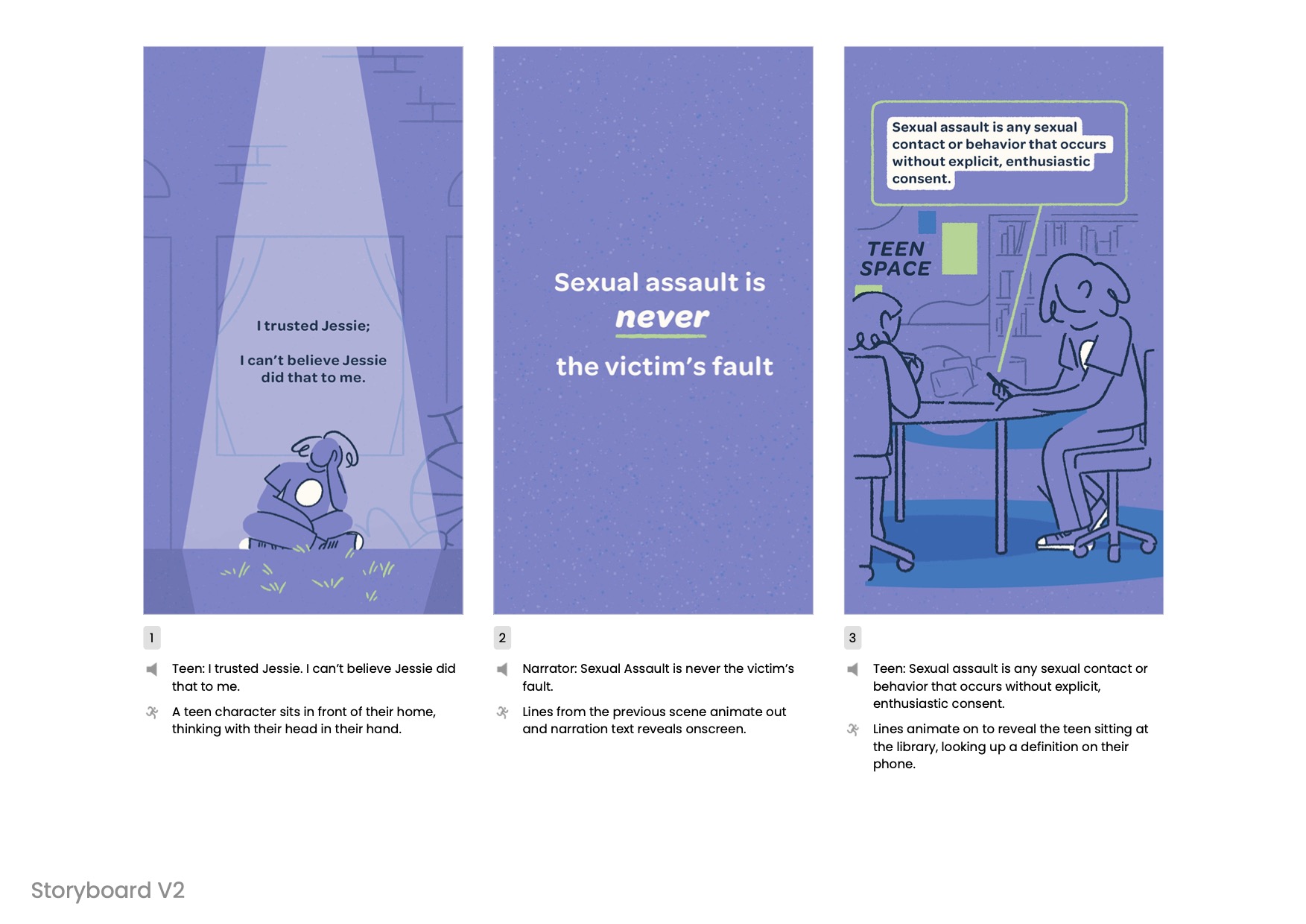
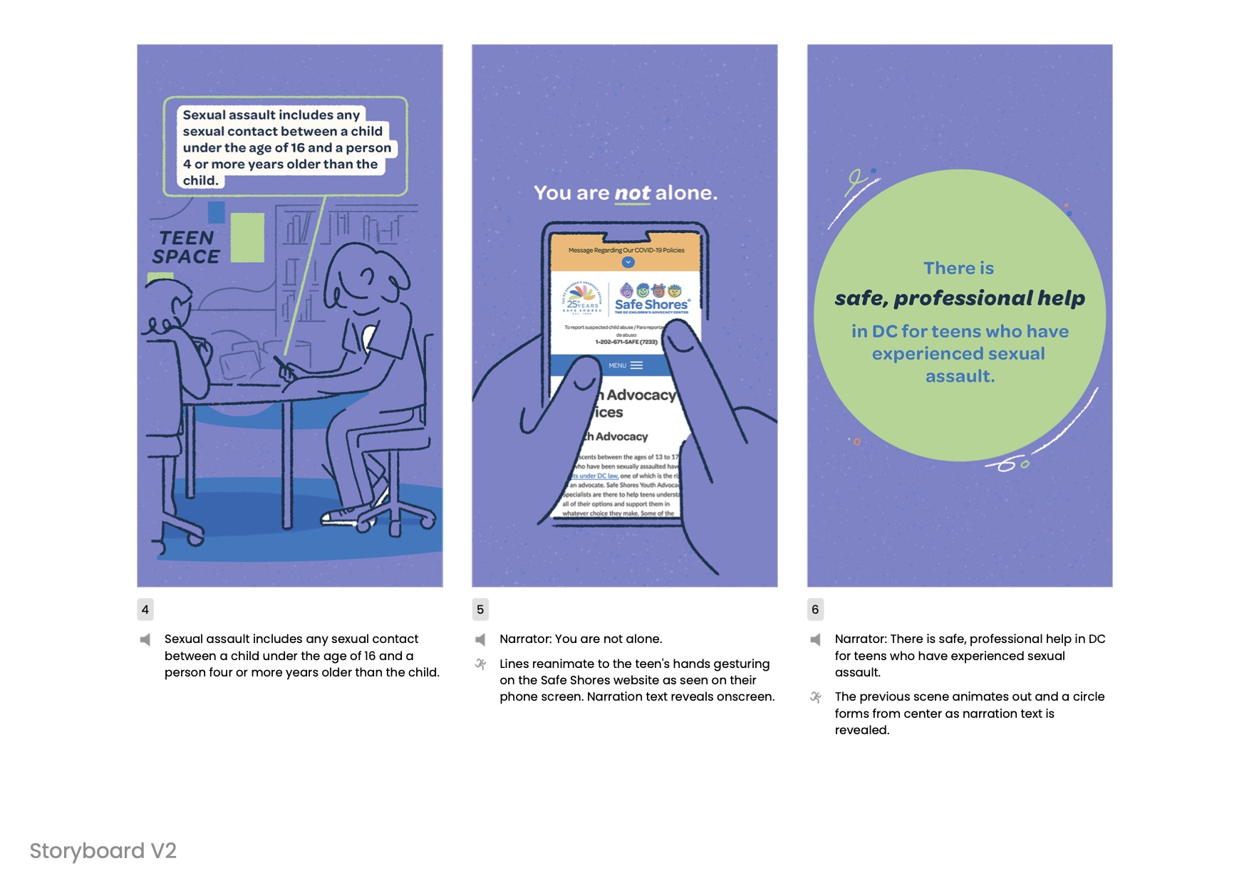
The project had to balance a few requirements: create age-appropriate content for teen viewers that discusses sensitive topics with appropriate gravity and maintains an ultimately hopeful and empowering message. The art direction needed to prioritize broad representation and accessibility while supporting Safe Shores’ established visual identity.
To meet these challenges, the visual design employed several thoughtful choices:
- Clean, efficient compositions paired with inky linework to complement the Safe Shores brand look and feel
- Semi-realistic silhouettes to ensure broad audience relatability
- Representational background elements to establish different settings
- Warm, inviting color palette
- Gender and racially ambiguous character designs to maximize inclusivity
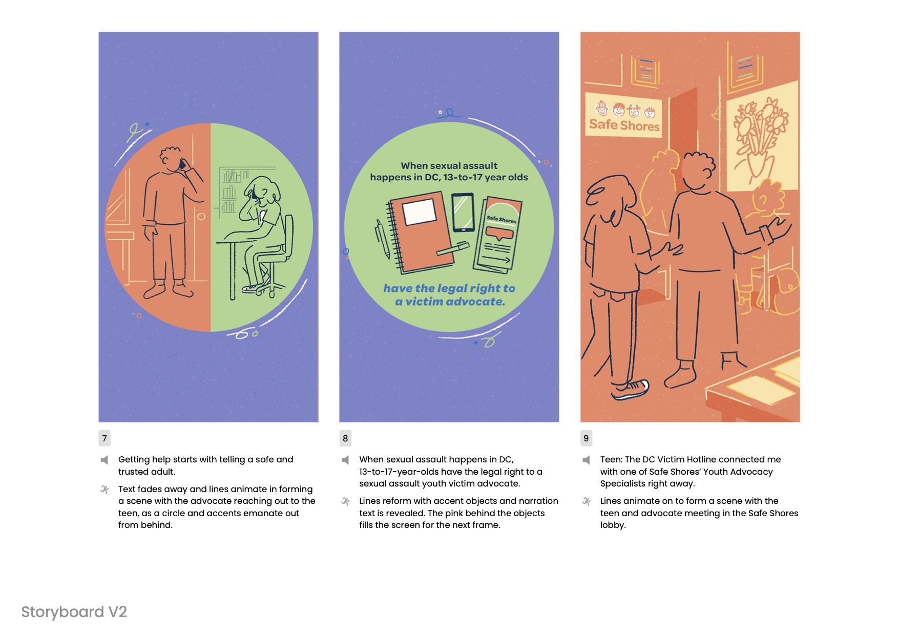
The developed look was largely based off of the Safe Shores logo, elevating the “smiley faces” for an older target audience.