Grounded in a philosophy that all elements should holistically work together to create an approachable and modern quality, the design elements entice viewers to explore Nestlé’s fun foodie content and learn about Nestlé’s commitment to creating positive and sustainable change.
Nestlé USA
Nestlé Design System
When you’re a brand as big and renowned as Nestlé, consistent visual representation is a must. At a minimum, internal and external comms should look harmonious. Ideally, every graphic element should elevate the brand’s message.
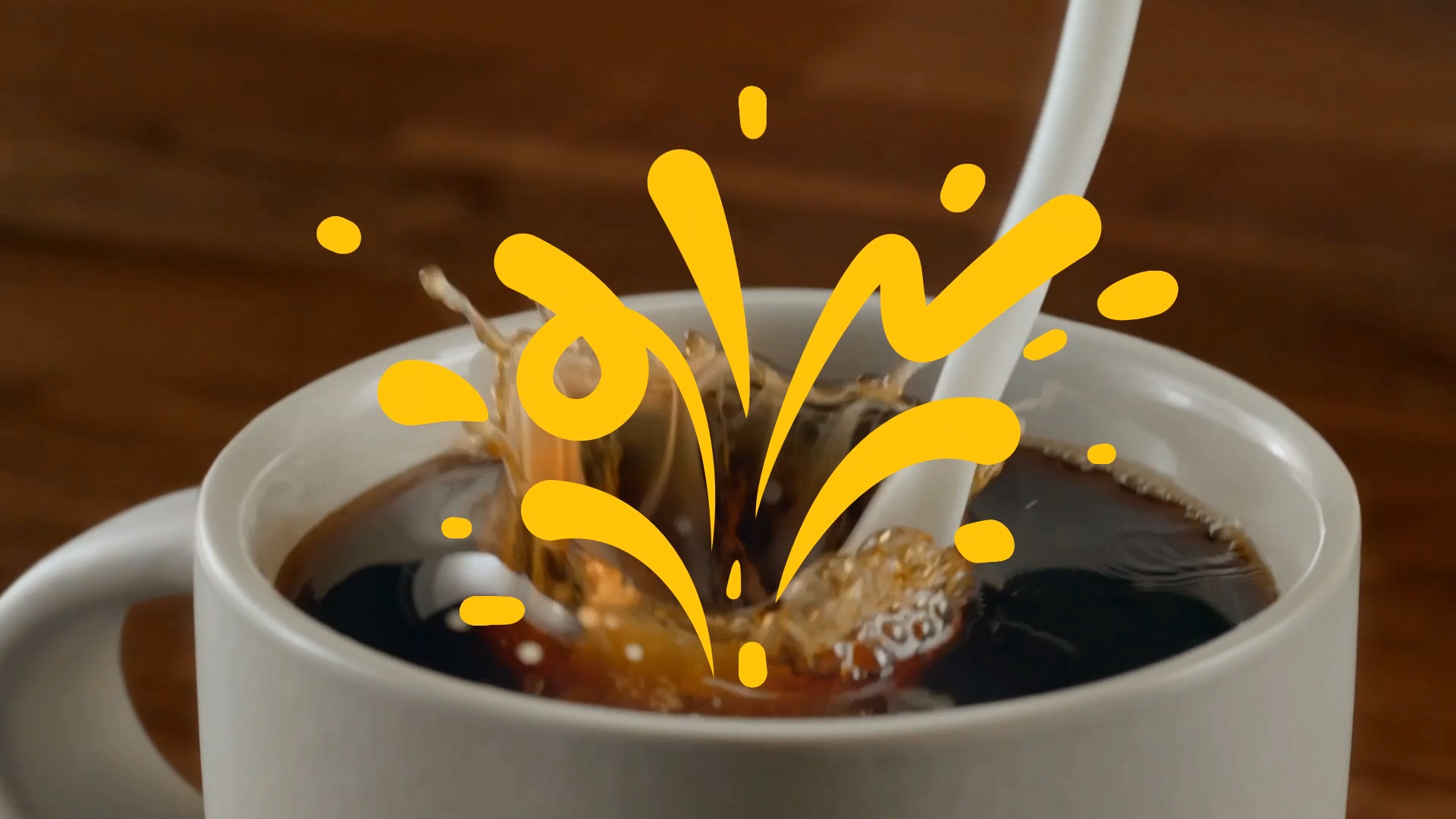
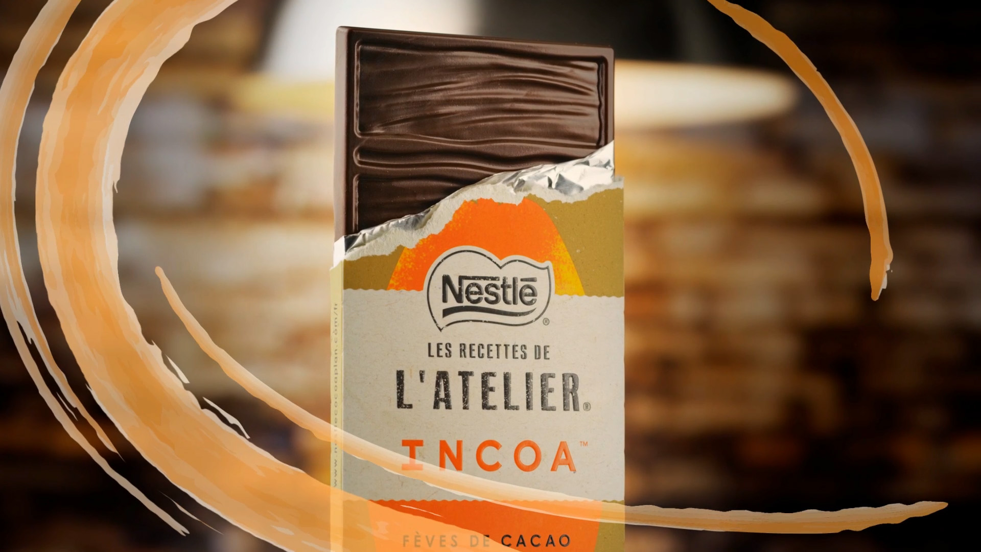
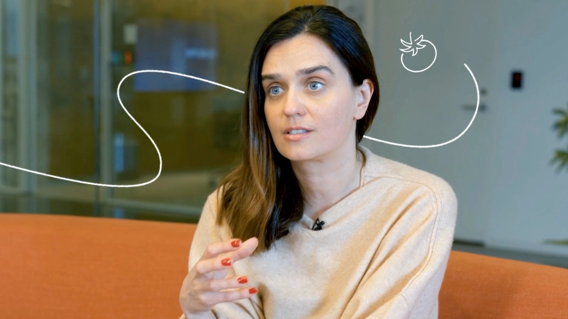
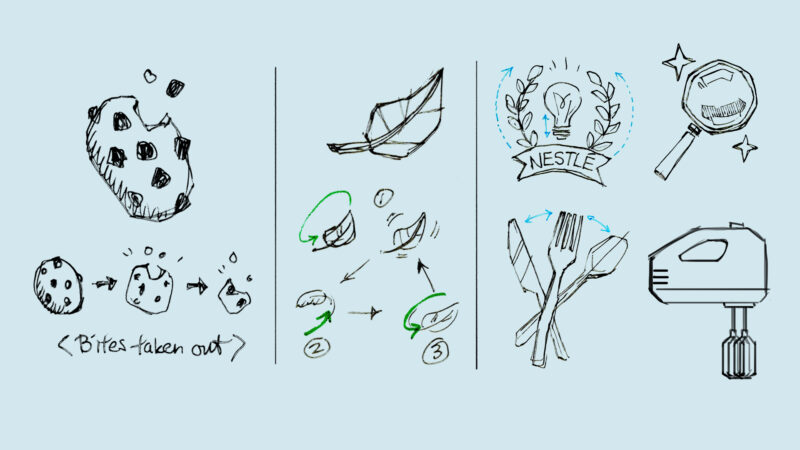
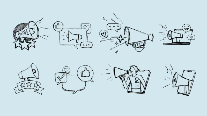
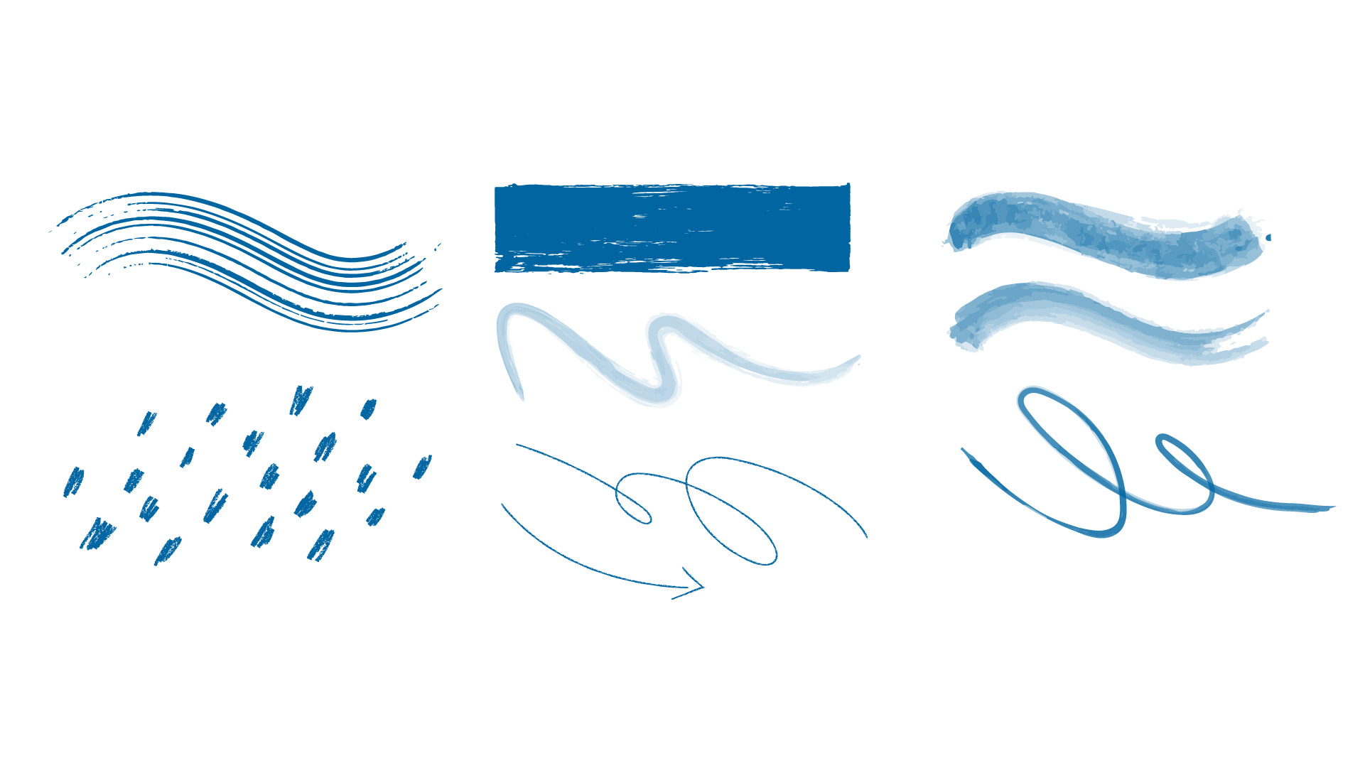
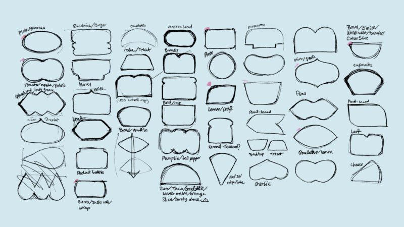
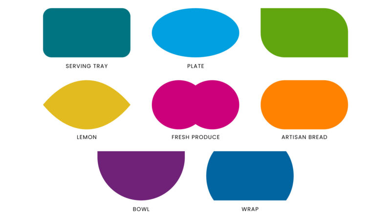
The robust design system we built for Nestlé checks those boxes. The friendly, handcrafted visual signature that we created for a previous award-winning Nestlé video series became the basis for a functional toolkit of assets that can be used and customized to suit the needs of the Nestlé team across their social and digital communications channels.
Visual Development
Flourishes

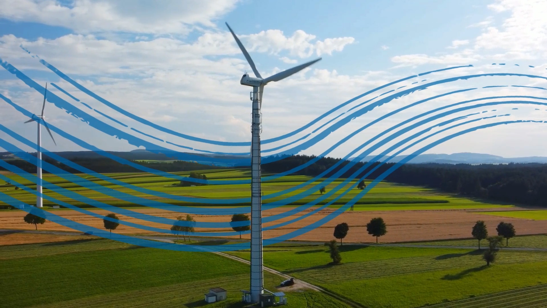
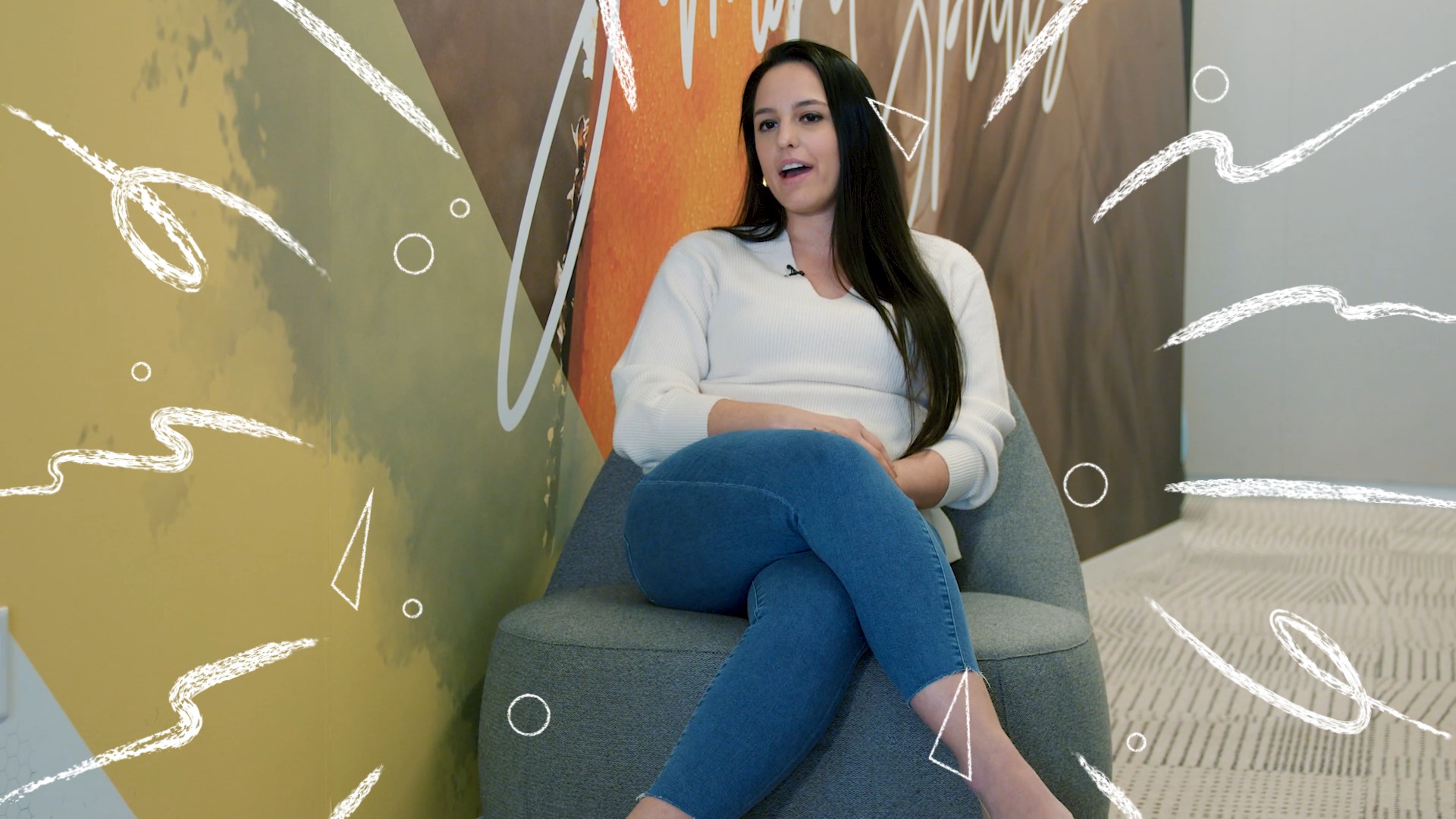
Transitions
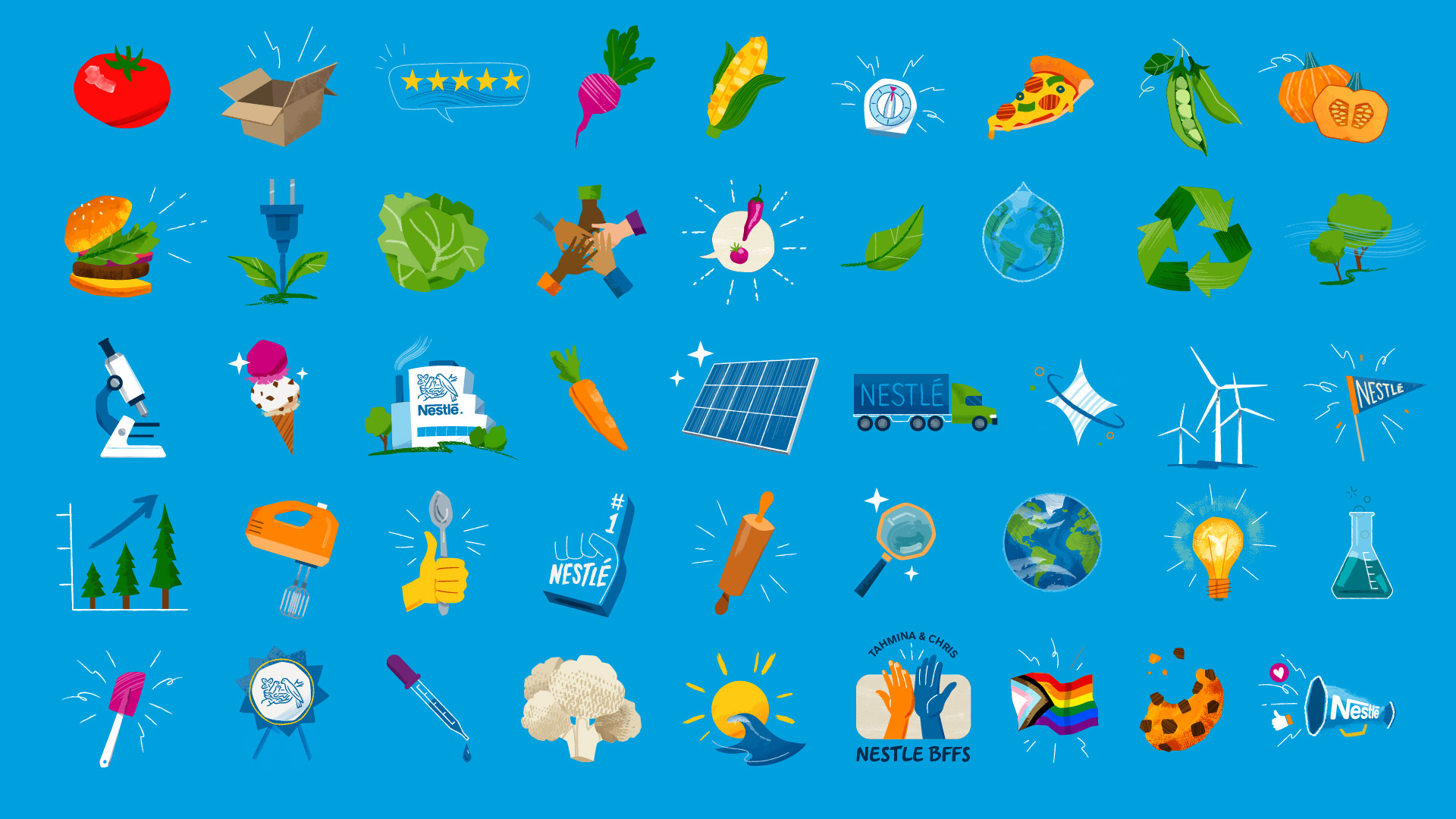
Illustrated Icons
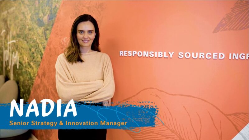
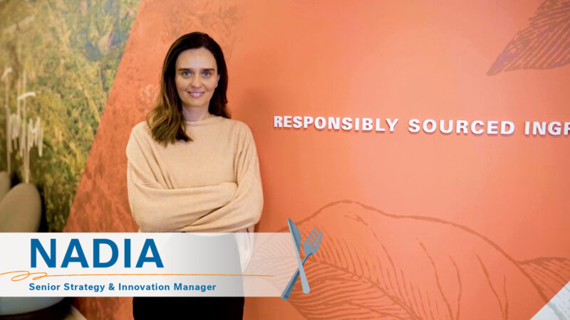
Lower Thirds
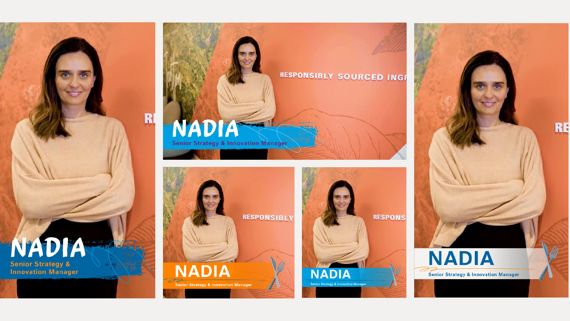
Split Screen Layouts
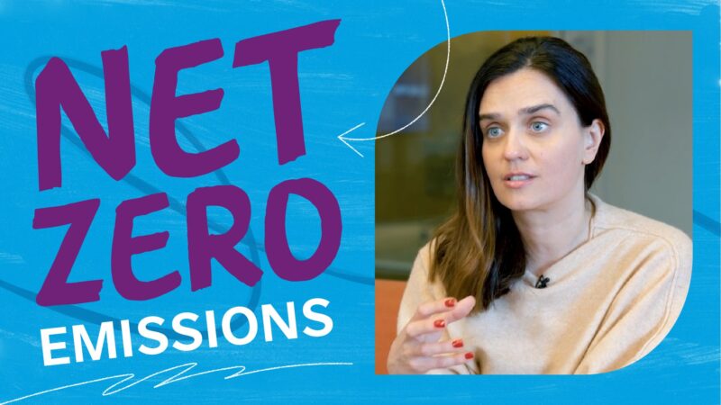
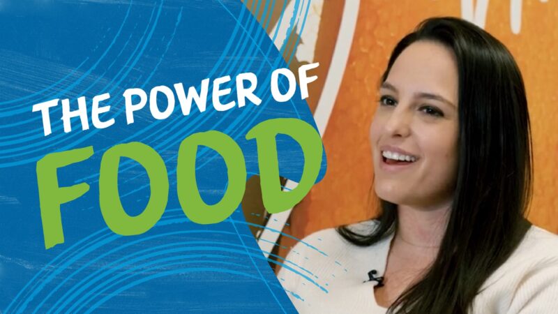
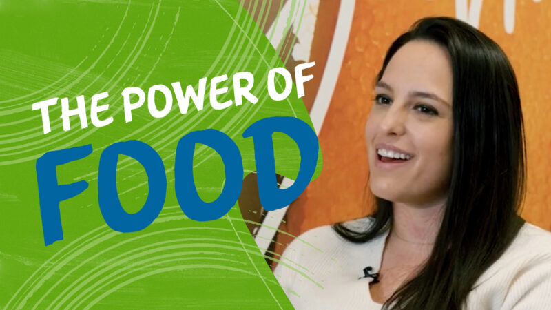
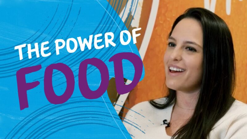
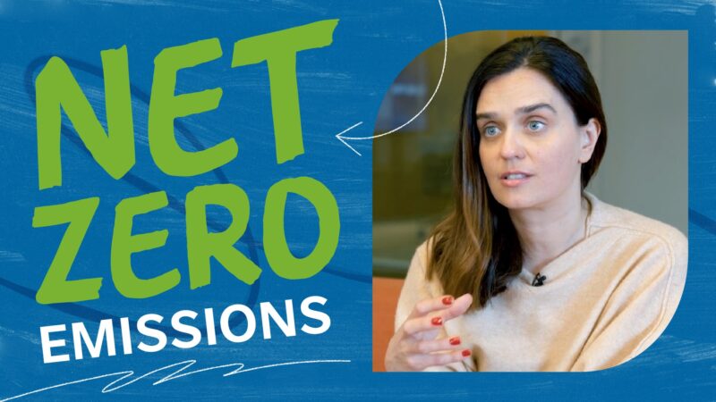
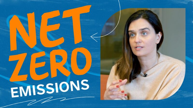
Backgrounds
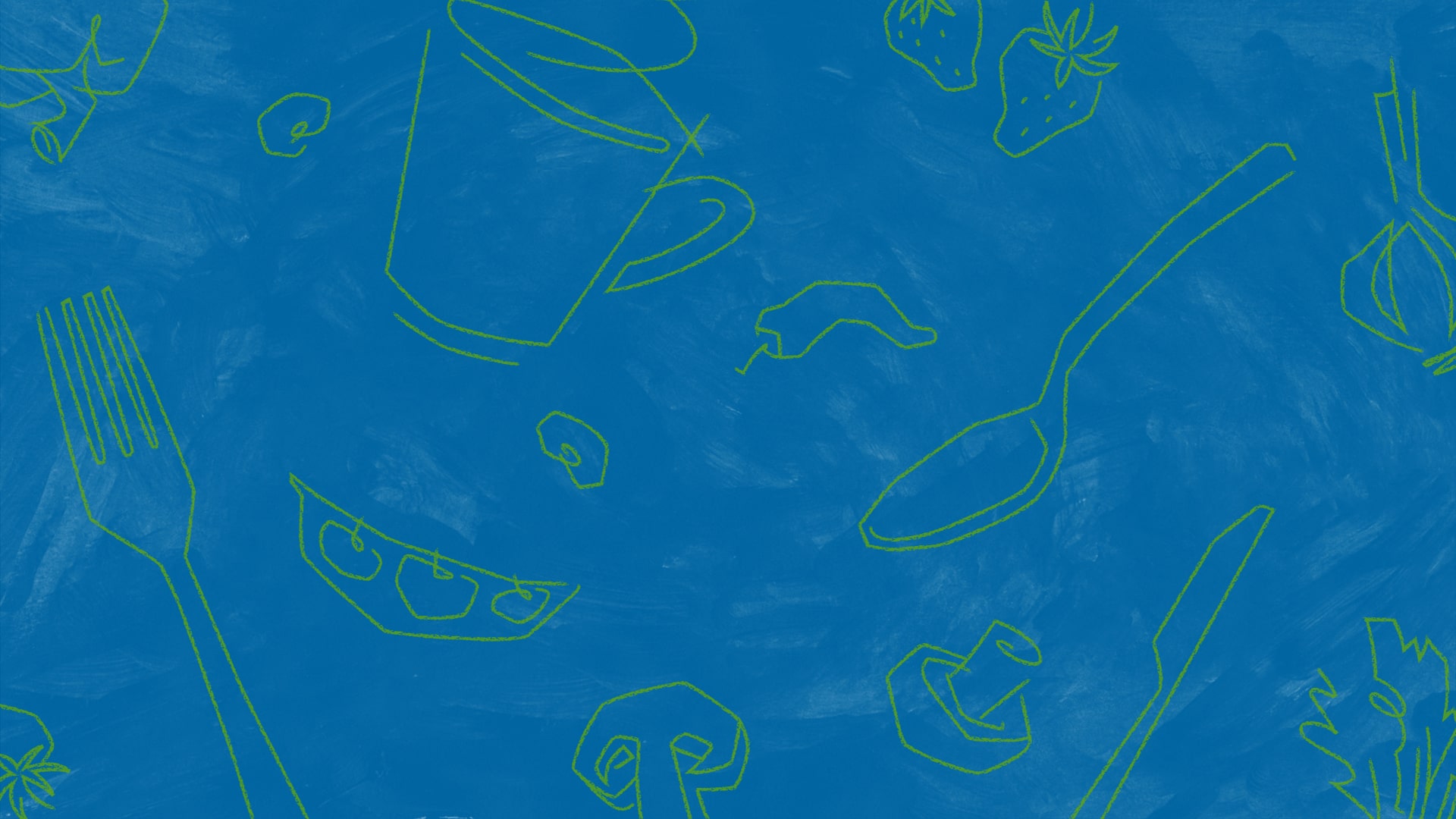
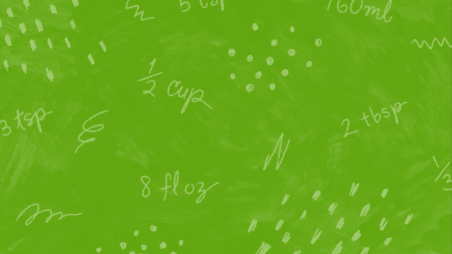


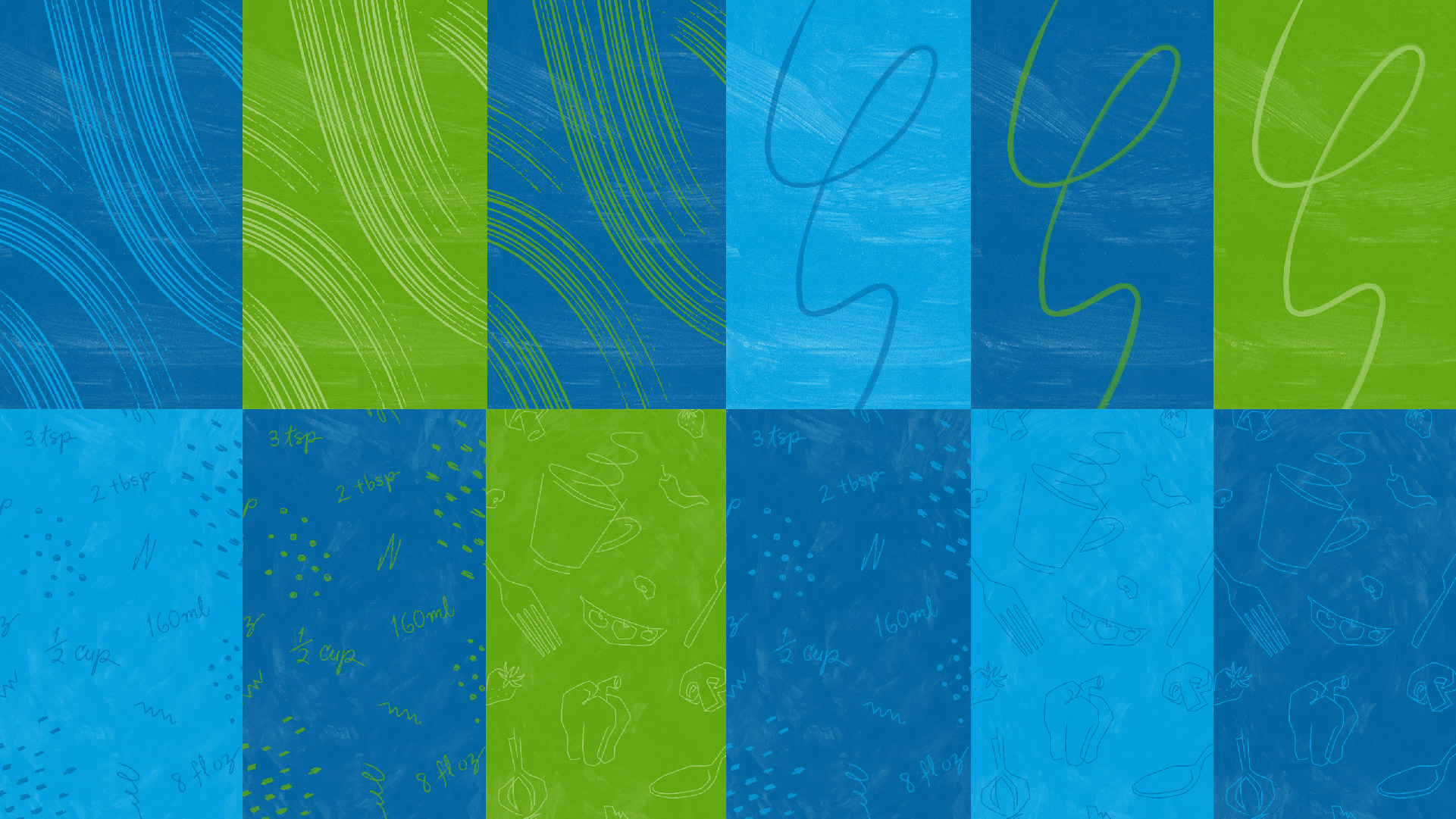
Textures & Shapes
Mission Accomplished
The design system has unified Nestlé’s digital brand and energized their video presence. From social content to explainers, their team is equipped with templates and tools to use across their platforms. Any Nestlé employee or outside vendor can easily grab pre-made assets or have a clear direction on how to create new designs that are in line with the visual universe.
Credits
Creative Development: Duke & Duck
Producer: Gina Falcone
Art Director: Katie Trayte
Design: Eri Hashimoto, Hannah Saidiner
Animation: John Martinez
Sound Design: Duke & Duck
